
Tableau Software, developed at Stanford University, allows users to import data and create a number of visualizations by dragging and dropping components onto a panel. Users can create any number of visualizations, develop interactive dashboards and publish them onto Tableau Public, a platform that allows you to share your visualizations or embed them into your own website and presentations. We tested Tableau Software in LIS 658 Information Visualization at Pratt Institute. Below is a report of my findings.
Materials
The materials required for this lab included a computer, Tableau desktop software, and a dataset to work with. Tableau Software was already available on the desktop computer of the Pratt Institute classroom where we performed the lab. Since the Nobel Prizes were going to be announced this week, I was interested in submissions from Nobel economics laureate, Joseph Stiglitz, in Columbia University’s Academic Commons repository.
Dataset: https://whysel.com/wp-content/uploads/2014/04/Stiglitz-AC-Downloads.xlsx
Tableau Software: http://www.tableausoftware.com/
Data Wrangler: http://vis.stanford.edu/wrangler/
Deliverables
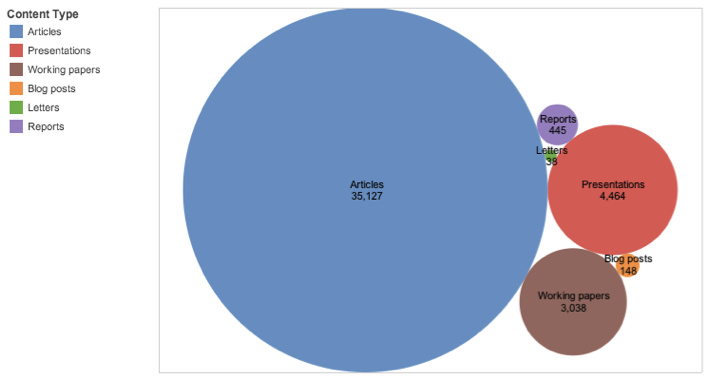
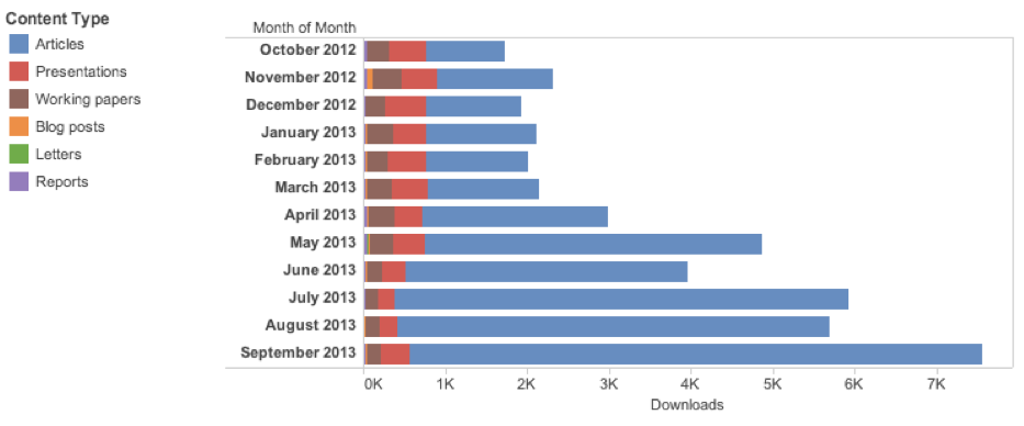
Downloads by Content Type
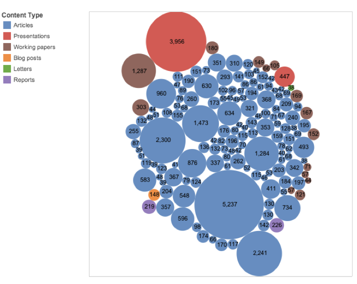
Total Downloads by Item
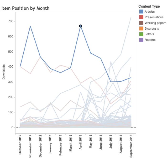
Item Change in Position Over Time
Most Popular Item by Month
Method
- Select the Data.
The first step is to find a dataset to work with. This can be something you have on your computer or something that you find on the Internet. Make sure that it is in a format that Tableau will accept. The following formats are accepted:- Tableau Data Extract
- Microsoft Access
- Microsoft Excel
- Text File
- Import from Workbook
Note that Tableau requires that the data be formatted in a normalized manner so that each row contains only one piece of data. I used a program called Data Wrangler to edit the raw data into a format that is readable by Tableau.
- Connect to Data.
To import data into Tableau, Click “Connect to Data.” Select the data format (I chose Excel). Then, select the workbook that you would like to import. - Create a View.
In the left column, you will see all of the data as identified by Tableau as Dimensions and Measures. Dimensions that are identified as text have an “abc” icon while dates have a calendar icon and geographic locations will have a globe icon. Dimensions can also be discrete numerical fields, like order numbers or zip codes. Measures are continuous numerical fields and are identified as numbers with the # symbol or as geographic data (latitude/longitude) with the globe icon.Make sure that the data format is identified properly. If not, for example, a date may be identified as a label rather than a numerical field, you may need to return to the dataset to edit the data. If you need to convert a discrete field to a continuous field, right click it in the Dimensions pane and select Number under Data Type, then right click again and select “Convert to Continuous.” - Select fields to analyze.
Drag a Dimension or Measure to the Columns “shelf” at the top right of the screen, and another Dimension or Measure to the Rows shelf. Notice that when you drag a discrete field to a view, it adds category headings, while a continuous field adds a scale. - Choose a Mark Type.
The Mark palette allows you to set the type of graph display. On Automatic, Tableau will select the graph type that best fits the data you selected. You can also use the Show Me button to opens a palette and allows you to select a Mark type for your visualization. Types of displays include line and bar charts, tables, maps, pie charts, circle or shape graphs, Gantt charts and other displays. This palette shows hints for the number of dimensions and measures to use for each kind of Mark type. - Add Mark Properties to the data.
The Marks palette also contains a set of functions that allow you to change properties of the data, such as the Color or Size of the display components, add Text or additional Detail.In the same palette, Tooltip allows you to Filter or remove a selection or view underlying data. Tooltip also allows you to indicate what to display when a user rolls their cursor over a datapoint on your display. You create these features by dragging a dimension onto the marks. - Create a Dashboard.
A Dashboard is a collection of views displayed on one sheet. To create a dashboard, select Dashboard | New Dashboard. From the left column, select a view to add to the new dashboard and drag it into place in the right pane.The layout is customizable, depending on where on the pane you drag each view. A gray area will indicate where you can drag a view. You can also select from the menu the items you would like to show on the dashboard, such as titles, legends and captions. Additional options in the left column allow you to change the dashboard size, add text, images or web pages, etc.Each time you add a new dashboard, it creates a new tab at the bottom of the screen. Dashboards and Views are noted by either a table icon (for Dashboards) or a spreadsheet icon (for Views). - Save Your Visualizations.
To save your workbook, click File | Save from the menu. You can also publish your workbook to Tableau Public by clicking Server | Publish Workbook. This will prompt you to log in to the website. If you do not already have an account, you can create one. Type a name for the workbook and click Save. - Share Your Visualizations.
Tableau offers a number of ways to share your visualizations. After saving a visualization, the preview panel offers a link to the view in Tableau Public or to embed the view into your web page. When you embed the view, you can also find share features at the lower left hand of the page by clicking on the icons for Facebook, Twitter, Email or Links.
Discussion
I created several views of Joseph Stiglitz’s work in Academic Commons. These views included visualizations of his work by content type, number of completed downloads and downloads per month over a twelve-month period:
- Circle Graph of the Content Type showing the number of downloads for each Content Type
- Graph of individual Titles, showing the number of downloads, colored by Content Type
- Bar chart of downloads by Content Type for each month
- Circle Chart showing each item and its position for each month (Showing the data for an individual item)

- Line Chart indicating the change in position of Stiglitz’s most popular item over time (most popular article selected to highlight spikes in downloads)
Discussion
It took some trial and error to learn how the various features of Tableau worked. I initially had some trouble importing the dates properly. I had a field that included the month and year, containing data for a full year from October 2012 to September 2013. Tableau read this data as a month and date. For example, “December 2012” was formatted as “Dec-12” which Tableau read as “December 12, 2013.” Once I corrected the data and re-imported the spreadsheet, it displayed properly in Tableau.
It was helpful to learn the difference between a data dimension and an attribute. When I initially dragged the title and date to the Rows I ended up with a lot of small multiples. When I changed the Title to an attribute of the number of downloads, I was able to show the number of downloads for each title on a single chart. I had to play around with the attributes and filters to remove null values and get the data to display on a single chart instead of small multiples. I also had to edit the colors of the Content Types as they were not displaying uniformly from one Workbook to the next. I had earlier changed the order of the Content Types displayed in the legend, which may have caused the problem.
One of the results of my analyses indicated that some of the articles in Joseph Stiglitz’s repository were duplicate entries. I noticed that the URL field in one particularly popular article had an asterisk instead of a URL and examined to the data to discover that indeed there were two copies of the same record, deposited at different times. I thought it was interesting that the software read the data each of these records as a single title and aggregated the downloads for each month into a single data point, because it meant that the visualization was providing a more accurate view of the data than the raw spreadsheet file.
Limitations of Tableau Software include the fact that it only works with the Windows operating system. I have a Mac System at home so I was not able to download and work further with my visualization. Also the cost is somewhat prohibitive at $999 per user for the personal edition and $1,999 for a professional version. Tableau offers a hosted version, Tableau Online, which is offered by subscription at $500 per user per year. Aside from these limitations, Tableau Software seems to be virtually limitless in the ways one can visualize data.
Future Directions
Tableau includes many features and functions that I did not use or did not have time to explore in depth. For example you can add a number of interactive features to dashboards to allow users to change the way Views are displayed by adding Actions and Filters. It would be nice to be able to click on a Content Type and have it explode into the individual documents, or to click on a bar chart showing downloads in January so that a separate column chart breaking that month out by Content Type. While exploring the Help documents from home, I also discovered the Pages feature, which would be another useful way to present information in a live visualization. There are many more features worth exploring.
Going back to my original data source, I think that Tableau visualizations would provide valuable insights to the Academic Commons team at Columbia University Libraries. We are always looking for ways to drive traffic to the repository. I would like to learn how to add a link to the URL so that when a user clicks on an item and sees the URL in the attribute box, they can click the URL to view the item in Academic Commons. I tried to do this with the Tooltip feature, by entering the HTML code for a link, but it displayed the code in the popup box and did not link to the repository. This could be a good way to highlight interesting features and explore document usage within a collection of materials, such as subjects, authors and departments and drive traffic to the site.
There were definite spikes in usage of article “Equilibrium in Competitive Insurance Markets” that occurred I November 2012 and April 2013. It would be interesting to study what event triggered these spikes. An analysis of all 11,000 items by author or department would also be interesting to see which areas could use more outreach by the data collection team.
The Academic Commons repository manager was particularly interested in the results of my analysis of duplicate records. Originally she was planning to simply delete one and add the Views and Download totals to the remaining record. When I showed her the analysis of downloads over a twelve-month period, it became clear that her plan would disrupt the data on the historical download rate for that article over time. This helped her to reconsider her plan for dealing with duplicate entries and she is now going back to the developer to work on a plan that won’t alter historical data. A similar analysis on other frequent depositors to look for duplicates would be a good idea.