Gephi is free, open source visualization software that allows users to display data in network graphs. I had some prior experience with Gephi visualizations as a viewer, as opposed to user. The technical infrastructure team at the Information Architecture Institute was working with Gephi to create website maps and concept diagrams of the IA Library. I admired the simplicity of the node and edges display and was happy to get hands on training in the tool.
Materials
Gephi is a powerful tool that lets people explore and display relationships and connections. For this project, I selected the Marvel Universe Social Graph from Infochimps:
http://www.infochimps.com/datasets/marvel-universe-social-graph
This dataset constructed by Cesc Rosselló, Ricardo Alberich, and Joe Miro from the University of the Balearic Islands contains Marvel characters and the comic book issues that they appeared in. It is a very large dataset holding 99,662 records.
Method
- Format your data.
Gephi requires a particular data format. Start by creating a spreadsheet with three columns for Source, Target and Type. The Source is the data that will represent the node or circles on the network graph. The Target represents the Edges or connections between nodes. The third column, Type, indicates the direction of the relationship. For this exercise, I entered Undirected for each record.Save your file as a comma-separated value (CSV) file. - Create a new project
On launch, Gephi will ask if you want to open an existing project or create a new one. Click “New Project.”
- At the top left of the screen, Click the “Data Laboratory” button, then the “Edges” tab, then “Import Spreadsheet.” This will import your data into an Edge Table.

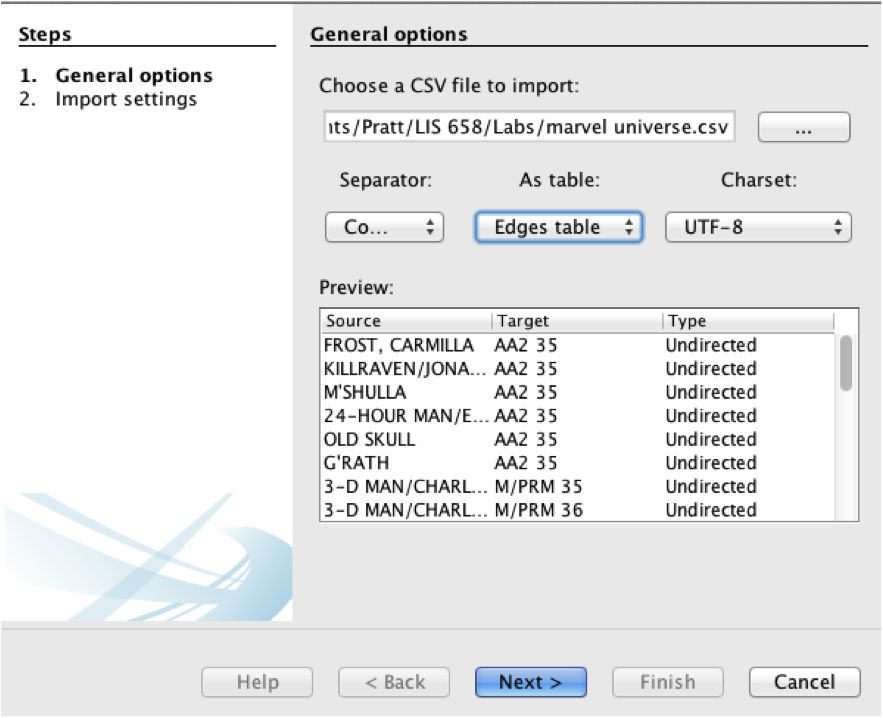
- Select a CSV file to import. Click the dropdown menu below “As Table:” and select “Edges table.” Then, click “Next.”
- If your dataset is very large, Gephi may ask to increase the memory allocated to the program. You will need to save your file and restart the program for this to take effect.
- In the next screen, if your data is numerical, you can set a datatype. Otherwise, leave as “String” and click “Finish.”The resulting Edge table will contain the three columns from your CSV file, Source, Target and Type, plus label and weight.Note on saving projects: It is a good idea to save your visualization frequently. After making major changes to the project, it is helpful to give an updated version number to the saved filename.
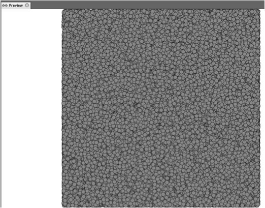
- Click the Overview button. This is where you can apply a layout, and adjust the color and size of your nodes and edges. At this point your visualization will look like a mass of gray circles.
You can now begin to format the visualization.
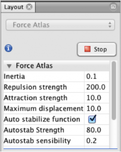
- Under the Layout panel on the bottom left, select “Force Atlas 2” from the dropdown menu, then click “Run.” The Force Atlas 2 layout is a force-directed graph, which is faster than Force Atlas, having a rough algorithm that renders quickly.
- The nodes will begin to separate and give shape to the graph. Lines representing the edges between nodes will begin to appear and stretch.
 The resulting visualization is called a force-directed graph, because the force of gravity or propulsion between them defines the relationship between two nodes. Isolates get pushed to the outside and will continue to float away to infinity. You can stop it by setting Gravity to a higher level. The . Depending on the number of nodes, rendering the graph could take some time.
 - Now we will add some color. On the Ranking tab in the top left panel, make sure the Nodes tab is selected and click the color circle. Select “Degree” from the dropdown menu.
 To the right edge of the color bar, you will see a small box for selecting color palettes. Click this box, and then click Default to open a range of color schemes. Select a color scheme that you like or that emphasizes the data appropriately.
- To adjust the relative size of the nodes, click the diamond shape on the Ranking tab. You can then select the minimum and maximum size of nodes and limit the range by number.
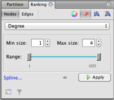
- The resulting graph may look something like this:
 Figure 1 The Marvel Comics UniverseThe Marvel Universe, in this example, is a dense mass of nodes with a several groups loosely connected to the center and a number of unconnected nodes floating toward the edges.A close view of the central nodes reveals groupings of related nodes within the dense structure.
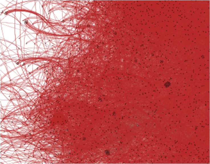
Figure 2 Detail of the Marvel Comics Universe
Additional Tools
Gephi has a number of additional tools that allow you to run statistical analyses and filters on the data. Rather than go through steps for using these tools, I highlight a few here.
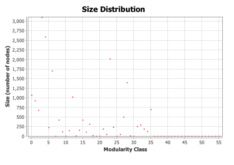
The Modularity chart shows the distribution of nodes by number of connections. The sample file indicates a modularity of 0.683 and 56 distinct communities of Marvel characters.
The Graph Distance Report shows the size of the network and length of the average path between nodes. The sample Marvel data indicates a graph diameter of 11 and an average path length of 4.45.
Filters allow you to select for various attributes and topologies.
Results/Discussion
My completed Gephi visualization can be downloaded at:
https://whysel.com/wp-content/uploads/2014/04/LIS658_Whysel_Gephi_Lab.gephi
Gephi is clearly a powerful analytical tool that requires some trial and error to use the functions properly. It is particularly important to have the data formatted properly before import and to make sure that you know the difference between a node table and an edge table. I had to re-import my data a few times before I got it right.
Also, different kinds of data may require a different layout. Once the data is imported it becomes a playground of possibilities. Any number of displays, analyses and filters can be applied to the resulting visualization.
The other thing that I noticed is that a large dataset can really slow down the performance of the tool, making rendering quite slow, especially when generating the initial layout and adjusting zoom levels.
As for the Marvel data, I was not surprised to find such a dense and interconnected graph. While I didn’t attempt to show node labels, it was clear that some groups were more connected to one another than others based on the patterns of the grouping and deepness of the hue.
Future Directions
The dataset I analyzed shows characters from the Marvel Universe and the series in which they appeared. It does not indicate the number of issues in each series the character appeared or whether the character was a major or minor player in the series. Some interesting directions one can take with the Marvel Universe dataset might be to apply weights to the relationships. For example, one could attempt to measure how many times within a series the character appeared, or how often one character interacted with another and apply those weights to the data in Gephi. The current visualization only indicates that the characters appear together. It would be interesting to figure out if Gephi would be able to measure the strength of the connection between characters in this way, but it would be quite an involved project!

