Interactive Maps
New York City Community Gardens by County
New York City Community Gardens and Subways
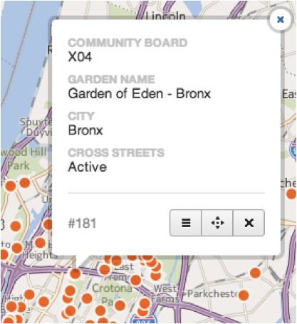
I created two interactive maps showing the location of New York City Community Gardens and Subways. The first map shows the gardens within the borough polygon and the second one shows gardens and subway stations. When the user clicks on a feature, information about the garden appears in an infobox, including the garden name, address, borough and the community board and council districts in which is it located. The subway infobox contains the subway line, the station name and entrance location, and the MTA website url of the selected station.
About CartoDB
CartoDB is an open-source cloud-based mapping application that allows users to analyze and create visualizations of uploaded datasets. According to the CartoDB website, the tool allows you to:
- Upload, visualize, and manage your data using the The CartoDB dashboard.
- Quickly create and customize maps that you can embed or share via public URL using the map embedding tool.
- Analyze, and integrate data you store on CartoDB into your applications using the SQL API.
- For more advance integrations of CartoDB maps on your website or application, use CartoDB.js
CartoDB uses a proprietary styling language CartoCSS and SQL query via PostGIS to create customizable visualizations. Completed visualizations can be exported, downloaded or embedded on a web page.
Materials
I started with a list of NYC Greenthumb Community Gardens that I obtained from the NYC Open Data portal and the NYC Subways, which was a sample table provided by CartoDB. I loaded these two data tables to CartoDB to process and create the visualizations.
CartoDB Website:
Data:
NYC Greenthumb Community Gardens:
https://data.cityofnewyork.us/Environment/NYC-Greenthumb-Community-Gardens/ajxm-kzmj
NYC Subways:
http://cartodb.s3.amazonaws.com/static/nyc_subway_entrance.zip
Method
To create my visualizations in CartoDB, I began by visiting cartodb.com and creating an account. The site where your data appears will be located at http://username.cartodb.com.
Next, click ìCreate your first tableí or drag a shape file to the file drop window. You can import files from your local drive, Google Drive, Dropbox or via URL. CartoDB also has a number of sample datasets that you can start with.
Once the table is imported, every row is given an ID number.
Click georeference under a column you wish to georeference. This column must be a full address or it will not be able to compute a geocoded location. A helpful formula in Excel concatenated my Address (column H), City (column I) and State (column J) columns to provide a full address that can be georeferenced.
=CONCATENATE(H2, “, “,I2,”, “, J2)
Once you import your dataset, it creates a table. Give your table name a simple name. You will use it a lot in SQL queries. You can import additional tables to compare data from one to the other, or boundary files that draw shapes, such as borough boundaries and Community Districts.
Results/Discussion
My completed CartoDB visualization is located at:
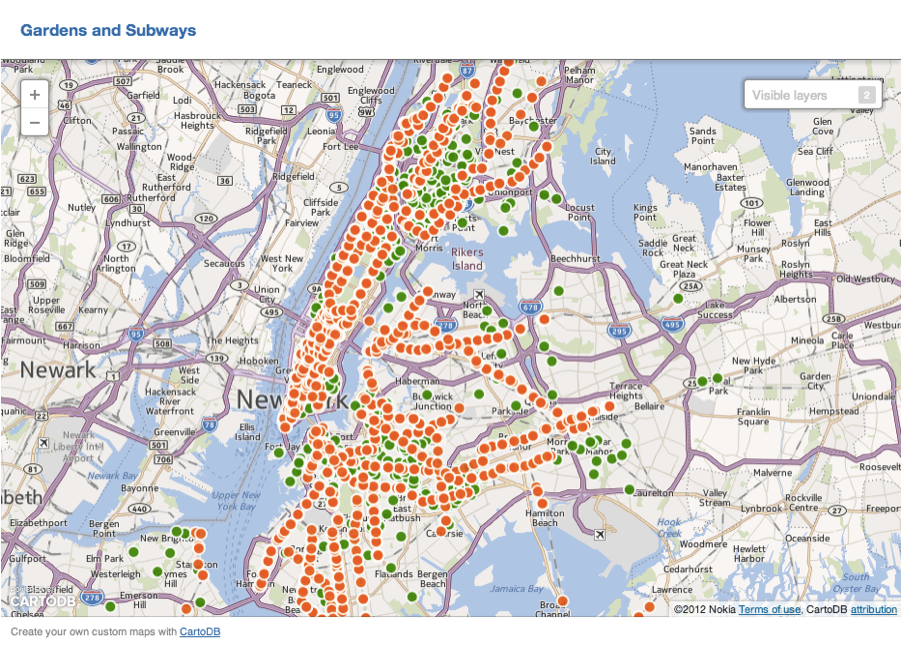
Map of NYC Greenthumb Community Gardens (green) and NYC Subway Entrances (orange):
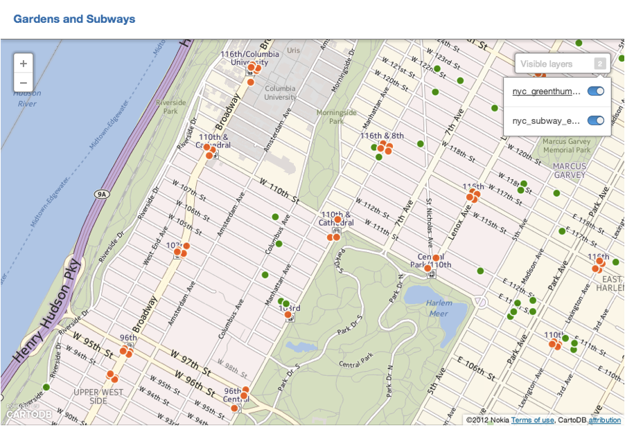
Close up view showing layers. It is possible to toggle data layers on and off using the visible layers feature:
There is a definitely a learning curve to CartoDB for someone who is not well versed in developing SQL queries in PostGIS. Understanding how to format your data properly before importing the file to CartoDB saves some headaches. I learned this when my attempt to georeference my address field, ended up plotting NYC gardens in several countries throughout the world. Clearly something wasnít reading correctly. I realized I needed a single column with the full address containing street address, city and state. The Excel concatenation formula described above fixed this problem
There were a number of these errors that I needed to correct manually, mostly addresses that were intersections rather than postal addresses. For example, one data point was plotted in Michigan that was supposed to be in The Bronx.
I found the correct address at the NY Restoration Project website and corrected the error by right clicking the misplaced datapoint and selecting Edit Data, indicated by the icon with three horizontal lines (see next image). This allows you to change the data in each cell. I entered the correct address into the form and clicked the button marked ìSave and Close.î
Even though I edited the cell to the correct address in The Bronx, the data point was still located in Michigan. I clicked ìEdit Geometryî indicated by the icon of a point surrounded by four arrows. This activated the point so I could drag it to the correct place on the map. When I was satisfied that the point was in the correct location, I clicked ìDone.î
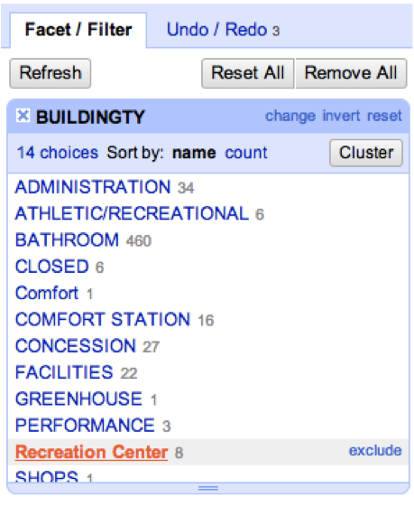
One of the fields in the Community Garden file included the community board district where each garden is located. I attempted to add another table with demographic data for community board districts, but had a lot of trouble. It would import the file headers but not the data.
I also attempted to import county files available using a file provided by CartoDB, but the shapes were inadequately drawn at the scale I needed. The boundaries did not fit the actual counties and some gardens were located outside their respective county polygons.
Next I imported the NYC Subways file also provided by CartoDB and this worked. I decided to see if I could map which gardens were located within a minimum distance from a subway. I found the following sample query in a post PostGIS manual at http://gisciencegroup.ucalgary.ca/engo500/texts/PostGISinAction.pdf:
SELECT c.city, b.bridge_nam, ST_Distance(c.the_geom, b.the_geom) As dist_ft
FROM sf.cities AS c CROSS JOIN sf.bridges As b;
I edited the query as follows to see if it would return the distance to the nearest subway station:
SELECT a.name, b.garden_name, ST_Distance(a.the_geom, b.the_geom) As dist_ft
FROM nyc_subway_entrance_export AS a CROSS JOIN nyc_greenthumb_community_gardens_fusion As b
This returned some unexpected results. Instead of the nearest subway it appeared to return the distance from the subway entrance at Central Park West & 96th St At Sw Corner. I would probably need more training in SQL and PostGIS to figure out how to edit the query to select the closest station.
Future Directions
I would like to keep working at finding the distance from Greenthumb gardens to their nearest subway station. It would also be interesting to map the gardens within their respective community board districts. Food justice is a big issue in New York City, which I have not addressed in this report. It would be interesting to find out how many gardens are located within a quarter mile of NYCHA housing or to map the gardens relative to supermarkets.
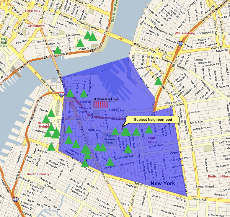
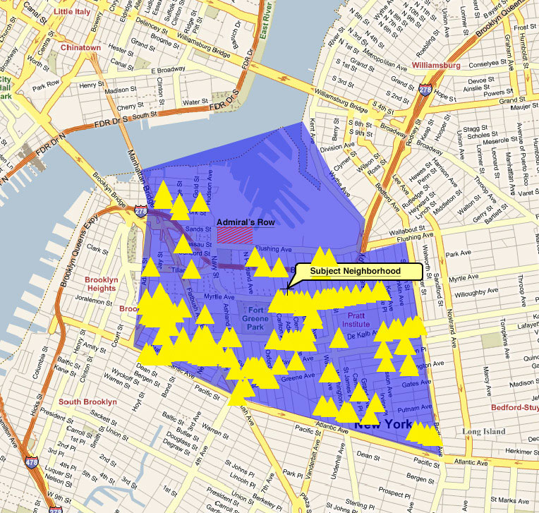
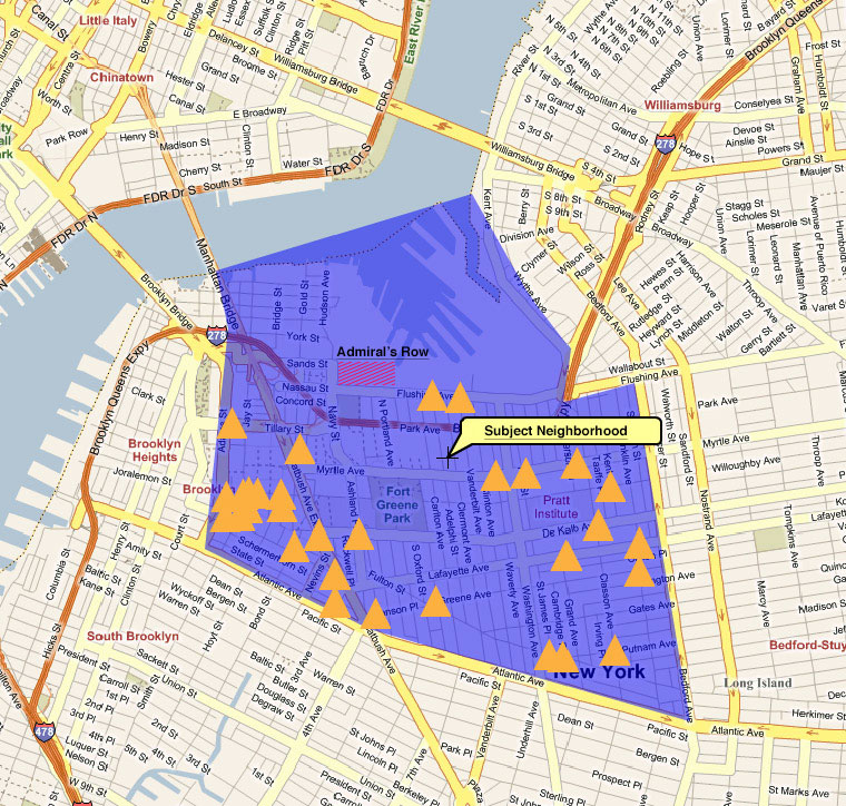
I did a GIS study of the area near the Navy Yard in Brooklyn for a real estate appraiser a few years ago, and the lack of nearby supermarkets was quite apparent.
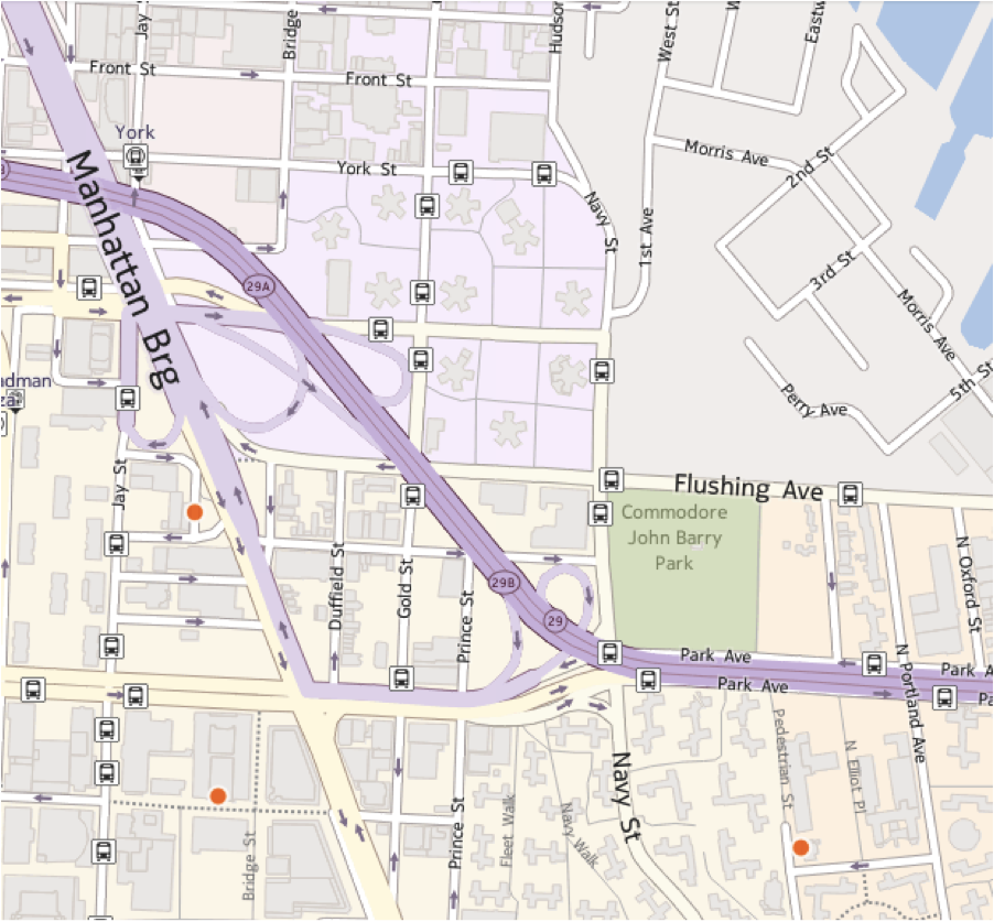
This visualization shows that the closest community garden to the Farragut Houses, adjacent to the Navy Yard, is Bridge Plaza Court garden, which is inconveniently located across the interchange for the Brooklyn-Queens Expressway and the Manhattan Bridge off-ramp. The next closest is at PS 67 in the Walt Whitman Houses across the expressway from Navy Yard. Most grocery stores in this area were bodegas and smaller sandwich shops and delis, with the next closest markets that do not require crossing an expressway being higher end specialty markets in the more expensive neighborhood of Vinegar Hill. Mapping the distances to community gardens, greenmarkets and supermarkets would give an interesting picture of food justice in the area.