Semiotics and Emergency Management

On November 1, 2014 I participated in a Semiotics Web and Information Architecture meetup at New York Public Library. My presentation, “Semiotics in Mapping and Emergency Response,” discusses symbology in mapping as an aspect of semiotics and presents an example of emergency response map symbology and a discussion of applications for first responders and broader uses.

Joining me were Loren Davie on Conversational Architecture – http://telltrail.me/ and CAVE language, Laureano Batista who discussed Steps Toward a Pragmatic Philosophy in the Age of Big Data and Neural Networks and Donald Gooden, the NY Chapter Leader of the OWASP Foundation, who spoke about the OWASP.org.

Read a detailed write up of this event by Nathaniel Levisrael at http://scignscape.appspot.com/meeting1-summary

Open Book Hackathon: PDF to Reflowable ePUB Format

NYPL Labs hosted Open Book Hack Weekend on January 11-12, 2014 at the New York Public Library featuring digital book open source and content development based on HTML5, EPUB, and the Open Web Platform. Readium Foundation, O’Reilly Media, Perseus Books, Hypothes.is, Google, and Datalogics sponsored the event.

I served as a user experience designer for my team, which included Dave Mayo of Harvard University, Julia Pollacks of the Bronx Community College, and Jeremy Baron. We worked on developing a way to convert PDF documents to reflowable EPUB format. We looked at converting government documents, including a sample of slip opinions from the United States Supreme Court. Sample documents and scripts are located at:

https://github.com/pobocks/pdf2freedom

PDF (or PDF + XML) to reflowable EPUB
Dave Mayo, Harvard University
Noreen Whysel, IA Institute
Julia Pollacks, Bronx Community College
Jeremy Baron

Presentation:

Let It Flow: Government e pubs (NYPL Open Book Hack 2014) from Noreen Whysel

A full list of projects presented at the Open Book Hack event is available at the OpenBook2014 github site:

https://github.com/openbook2014/nypl-hack-weekend/wiki/Hack-ideas

NYC Garden Maps Blog

NYC Garden Maps is a pathfinder for information on starting and running a community garden in NYC and contains news and historical features.

Community gardening in New York City has a long history, beginning with a school farm garden created at De Witt Clinton Park in 1902 through the modern community garden and food justice movements. The resources on this blog cover information on community gardening in New York City, including the history of community gardening, guidelines specific to New York City gardens, and general information about gardening. If you are thinking of starting a community garden in New York City, this information will help you in building and managing your garden, locating organizations that can provide education, supplies and grant funding and, of course, links to garden mapping initiatives and map software that you can use to plan and manage your garden.

This pathfinder was a final graduate project completed for the Summer Map Institute of Pratt Institute School of Information and Library Science. The course is taught by Matt Knutzen of the New York Public Library’s Lionel Pincus and Princess Firyal Map Division.

Emergency Management: NYC OEM Timeline

In 2011, I participated in the NYC GeoSymposium 2001-2011-2021, which took a look at the advances and challenges of Geographic Information Systems in emergency response since 2001. I had been working with colleagues at GISMO for many years to draw attention to the important role geographers played in the 9/11 rescue and recovery. The GeoSymposium was a great experience, because it intended not just to honor those who participated in these efforts, but also to highlight the need to preserve the thousands of maps that tell the story.

My own contribution to the GeoSymposium was to explore the legacy of these efforts by examining the technological improvements at the Office of Emergency Management in the context of emergency events that had occurred since 2001. I was looking for a way to present time-based information in a map format and also to start a conversation with attendees about the history of emergency response technology and the importance of the preservation of geographic artifacts. My project contained a map of New York City with events plotted and color-coded by discrete periods, characterized by a common group of new technologies. An online version of the map is available at ArgGIS Explorer Online.

OEM-Incidents-interactive-map

View Interactive Map


Download OEM Incident Map – Poster

OEM-Incidents-screenshot

Sample Slide:
Screen Shot 2015-09-10 at 2.45.54 PM
View Detail Slides (Requires Microsoft Silverlight)

The map highlights how the events surrounding 9/11 prompted improvements in incident management technology. Attendees, including the keynote presenter and eminent information designer, Edward Tufte, gathered around to discuss their experience with the events I had mapped and to offer advice on ways to enrich its design. (Some of Mr. Tufte’s comments led to further improvements which you can see via the links above.)

Simply talking about how to improve the map was an exercise in exploring history and memory: how people understand what happened, how events are related to one another, how what you choose to include and what not to include can influence a person’s understanding of the events, how the description of one event can bring to mind another similar one, etc. It was thrilling to observe the spontaneous conversation that started all because of a three by four foot piece of foamboard.

For more details and context around the planning for a 9/11 Map Archive, see my blog post, Towards a 9/11 GeoArchive.

Fire and Light: Illumination in Religious Art

magdalen-annual-report-coverFire and Light is Noreen Whysel’s final project for Ken Soehner’s course, Museum and Library Research, at Pratt Institute School of Information and Library Science. The course took place at the Metropolitan Museum of Art in New York City and consisted of two weeks of full-time seminar and research training followed by a month spent researching the various items in the exhibit. The culmination of the project was a exhibition catalog of twelve pieces in the museum collection which exemplify the theme of illumination in religious and devotional art.

Visit the Fire and Light website.

Other Assignments for this course included the following:

Book Review: Le vite de’ pittori, scultori et architetti moderni by Giovanni Pietro Bellori

Exhibit Review: The Boxer

Bloomingdale Neighborhood Timeline

The West 104th Street Block Association provided a historical overview of the Bloomingdale neighborhood from Broadway to Riverside Park above 100th Street by historian Gil Tauber. I created the following timeline presentation using Verite’s Timeline JS and Gil’s data.

West 104th Street Block Association Web Redesign

Background

The goal of the West 104th Street Block Association website redesign was to create a modern website that addresses the current needs and expectations for residents and those considering a move into the Bloomingdale neighborhood. The old site had not been updated since 2007, and even then, had retained the frame-based navigation that limited the usability and findability of the website and it’s contents.

Method

We started with a user research study, dividing the target users into four groups: new resident couples, families with children, senior citizen residents and prospective residents. I focused on the senior citizen population in the neighborhood. Details on the user research process are available in a separate portfolio piece on this site. All images below represent my contributions to this project.

Drawing from the results of these studies, our team developed personas and user scenarios.

User Scenario - West 104th Street Block Association
User Scenario – West 104th Street Block Association

Persona - - West 104th Street Block Association
Persona – – West 104th Street Block Association

My team created an online, unmoderated card sort, using Optimal Sort. Our findings indicated the most important information residents are seeking is community events and services, Block Association member benefits and contact information, newsletters, and general information about the Block. From this we created a top level navigation including About Us, About the Neighborhood, Resources, Newsletters and Membership. These labels were refined in further testing. Block Association board members also wanted to highlight sponsors who donate to the association, so we create different a segment in the footer and included under the About Us section.

Next, I sketched out designs for the home page, calendar and membership pages.

Home Page Sketch - West 104th Street Block Association
Home Page Sketch – West 104th Street Block Association

Events Page Sketch - West 104th Street Block Association
Events Page Sketch – West 104th Street Block Association

I refined the sketches into wireframes using Omnigraffle.

Home Page Wireframes - West 104th Street Block Association
Home Page Wireframes – West 104th Street Block Association

Event Page Wireframes - West 104th Street Block Association
Event Page Wireframes – West 104th Street Block Association

Join Page Wireframes - West 104th Street Block Association
Join Page Wireframes – West 104th Street Block Association

Outcome

The board of the block association voted to implement our design. I built the new site using WordPress theme Modernize, with some customizations. The new design features improved layout and navigation, legible fonts, searchable newsletter archive, updated content, livelier images, and the ability for board members to edit and add content without needing to understand HTML or php.

A description of a user research study for the website redesign and design deliverables are available at http://whysel.com/portfolio/west-104th-street-block-association-redesign/

Old site:

Screen Shot 2014-04-06 at 1.49.48 PM

New site:

Screen Shot 2014-04-06 at 1.49.48 PM

You can view the site in progress at http://www.bloomingdale.org/.

Archiving Digital Maps

My research examines the historical challenges faced by a local GIS community and its advocacy for improved access and availability of geographic data on local and national levels. I was primarily interested in the data access issues that led a group of geographers in New York City to develop a centralized data repository and basemap, and examined concurrent practices at the national level. I intend to use the results of this research to inform the development of a born-digital archive of 9/11 artifacts in cooperation with members of GISMO, a New York City based GIS advocacy group.

Methods: I used qualitative research methods to evaluate the current landscape of archival practices for digital, geospatial content. I examined monographs, scholarly journal articles, conference proceedings, news articles, and website materials.

This project presents a thorough evaluation of archival practices and challenges for digital, geospatial material. My research includes a definition of geographic data, an overview of geographic data classification, geolibraries and geospatial preservation models, and challenges for the management, sharing and maintenance of geospatial collections. I concluded with actionable ideas for librarians who are developing a geographic collection.

Report: Download PDF

West 104th Street Block Association User Research Report

Background

The goal of the user research evaluation was to provide an analysis of a specific user population to understand their needs and expectations for a redesigned block association website (bloomingdale.org).

Persona - - West 104th Street Block AssociationThe team identified four target populations, including childless singles and couples living in the neighborhood, resident families, families seeking housing in the neighborhood and resident senior citizens and older adults. The result was a user research report of an assigned target population, including a survey of 5-10 potential website users, two participant observations, two participant interviews, a persona reflecting a typical block association member, and a user scenario describing a specific use case for the website.

Method

Of the four user populations, my target group was Senior Citizens and Older Adults. I employed two user research methods: interviews and observations. Participants included members of the community that the block assocation represents who were selected from personal contacts and on-site, guerilla research at the association’s annual yard sale. I collected demographic information about each participant and recorded feedback. The interviews took place in person and by telephone and followed a standard interview protocol. The observation was open-ended and involved viewing participants as they navigated three competitive websites and taking note of actions and feedback that might suggest potential new content, problems and improvements. Both methods followed a script developed by the group and contained a brief questionnaire and open ended activities that I tailored to the study population. The results provided insight into the interests and motivations of the target user group and information for refining the content and functionality of the current website.

Outcome

This project illustrates mastery of the User-Centered Design. I applied professional User Experience methods to create an in-depth analysis of a typical user population for a website. It not only required advanced research and writing skills, but also personal communication skills and sensitivity toward senior citizens with widely varying computer capabilities.

As a result of the user research study, the West 104th Street Block Association engaged our team to complete the redesign of their website.

Deliverables

User Research Report: Download PDF

User Persona: Download PDF

User Scenario: Download PDF

Sketches: Download PDF

Wireframes: Download PDF

Additional User-Centered Focus Projects

Group Project – Usability Test Plan: Download PDF

Cognitive Walkthrough – Wunderground.com: Download PDF

Heuristic Analysis – Ohiosci.org: Download PDF

Diary Study – Facebook.com: Download PDF

User Test – WebMD.com: Download PDF

Gephi – The Marvel Universe

Gephi is free, open source visualization software that allows users to display data in network graphs. I had some prior experience with Gephi visualizations as a viewer, as opposed to user. The technical infrastructure team at the Information Architecture Institute was working with Gephi to create website maps and concept diagrams of the IA Library. I admired the simplicity of the node and edges display and was happy to get hands on training in the tool.

Materials

Gephi is a powerful tool that lets people explore and display relationships and connections. For this project, I selected the Marvel Universe Social Graph from Infochimps:

http://www.infochimps.com/datasets/marvel-universe-social-graph

This dataset constructed by Cesc Rosselló, Ricardo Alberich, and Joe Miro from the University of the Balearic Islands contains Marvel characters and the comic book issues that they appeared in. It is a very large dataset holding 99,662 records.

Method

  1. Format your data.
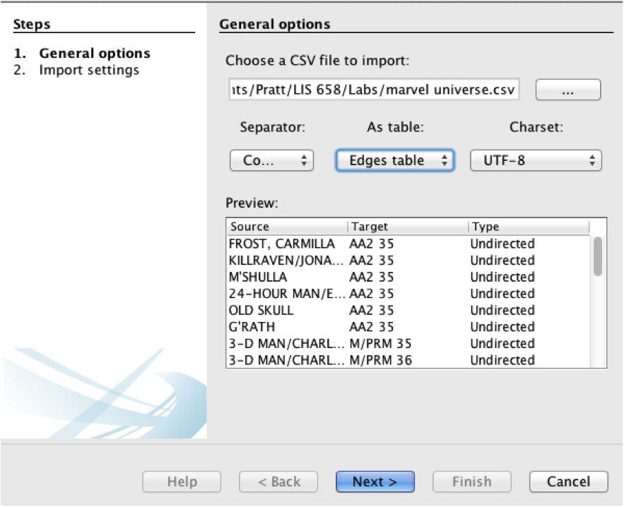
    Gephi requires a particular data format. Start by creating a spreadsheet with three columns for Source, Target and Type. The Source is the data that will represent the node or circles on the network graph. The Target represents the Edges or connections between nodes. The third column, Type, indicates the direction of the relationship. For this exercise, I entered Undirected for each record.Save your file as a comma-separated value (CSV) file.
  2. Create a new project
    On launch, Gephi will ask if you want to open an existing project or create a new one. Click “New Project.”gephi-new-project
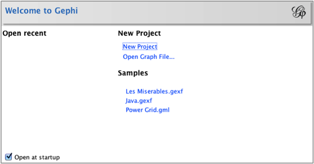
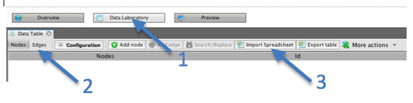
  3. At the top left of the screen, Click the “Data Laboratory” button, then the “Edges” tab, then “Import Spreadsheet.” This will import your data into an Edge Table.gephi-import-spreadsheet
  4. Select a CSV file to import. Click the dropdown menu below “As Table:” and select “Edges table.” Then, click “Next.”
    gephi-general-options
  5. If your dataset is very large, Gephi may ask to increase the memory allocated to the program. You will need to save your file and restart the program for this to take effect.
  6. In the next screen, if your data is numerical, you can set a datatype. Otherwise, leave as “String” and click “Finish.”The resulting Edge table will contain the three columns from your CSV file, Source, Target and Type, plus label and weight.Note on saving projects: It is a good idea to save your visualization frequently. After making major changes to the project, it is helpful to give an updated version number to the saved filename.
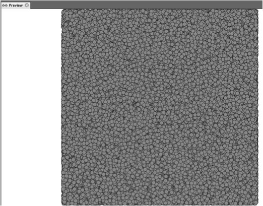
  7. Click the Overview button. This is where you can apply a layout, and adjust the color and size of your nodes and edges. At this point your visualization will look like a mass of gray circles.marvel-grey-mass

You can now begin to format the visualization.

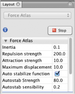
  1. Under the Layout panel on the bottom left, select “Force Atlas 2” from the dropdown menu, then click “Run.” The Force Atlas 2 layout is a force-directed graph, which is faster than Force Atlas, having a rough algorithm that renders quickly.gephi-layout-panel
  2. The nodes will begin to separate and give shape to the graph. Lines representing the edges between nodes will begin to appear and stretch.marvel-force-directedThe resulting visualization is called a force-directed graph, because the force of gravity or propulsion between them defines the relationship between two nodes. Isolates get pushed to the outside and will continue to float away to infinity. You can stop it by setting Gravity to a higher level. The . Depending on the number of nodes, rendering the graph could take some time.
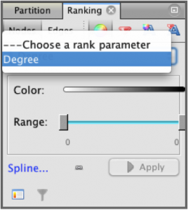
  3. Now we will add some color. On the Ranking tab in the top left panel, make sure the Nodes tab is selected and click the color circle. Select “Degree” from the dropdown menu.gephi-ranking-panelTo the right edge of the color bar, you will see a small box for selecting color palettes. Click this box, and then click Default to open a range of color schemes. Select a color scheme that you like or that emphasizes the data appropriately.gephi-color-scheme-panel
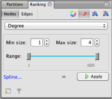
  4. To adjust the relative size of the nodes, click the diamond shape on the Ranking tab. You can then select the minimum and maximum size of nodes and limit the range by number.gephi-node-size-panel
  5. The resulting graph may look something like this:marvel-gephi-graphFigure 1 The Marvel Comics UniverseThe Marvel Universe, in this example, is a dense mass of nodes with a several groups loosely connected to the center and a number of unconnected nodes floating toward the edges.A close view of the central nodes reveals groupings of related nodes within the dense structure.marvel-gephi-graph-detail

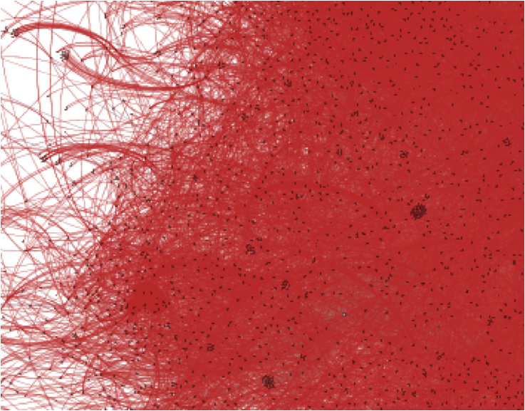
    Figure 2 Detail of the Marvel Comics Universe

Additional Tools

Gephi has a number of additional tools that allow you to run statistical analyses and filters on the data. Rather than go through steps for using these tools, I highlight a few here.

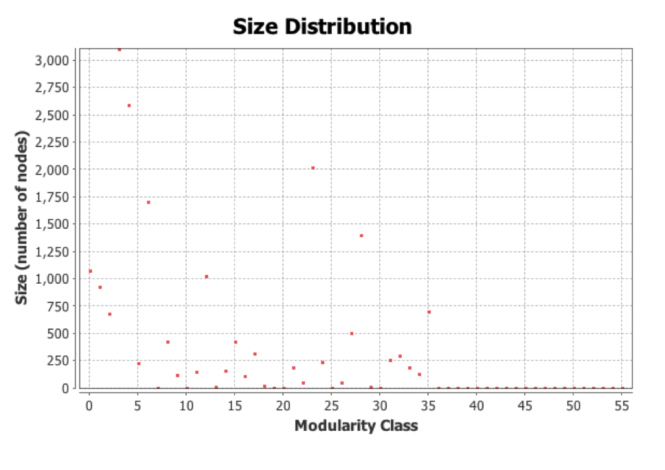
The Modularity chart shows the distribution of nodes by number of connections. The sample file indicates a modularity of 0.683 and 56 distinct communities of Marvel characters.

marvel-size-disribution

The Graph Distance Report shows the size of the network and length of the average path between nodes. The sample Marvel data indicates a graph diameter of 11 and an average path length of 4.45.

Filters allow you to select for various attributes and topologies.

Results/Discussion

My completed Gephi visualization can be downloaded at:

http://www.whysel.com/wp-content/uploads/2014/04/LIS658_Whysel_Gephi_Lab.gephi

Gephi is clearly a powerful analytical tool that requires some trial and error to use the functions properly. It is particularly important to have the data formatted properly before import and to make sure that you know the difference between a node table and an edge table. I had to re-import my data a few times before I got it right.

Also, different kinds of data may require a different layout. Once the data is imported it becomes a playground of possibilities. Any number of displays, analyses and filters can be applied to the resulting visualization.

The other thing that I noticed is that a large dataset can really slow down the performance of the tool, making rendering quite slow, especially when generating the initial layout and adjusting zoom levels.

As for the Marvel data, I was not surprised to find such a dense and interconnected graph. While I didn’t attempt to show node labels, it was clear that some groups were more connected to one another than others based on the patterns of the grouping and deepness of the hue.

Future Directions

The dataset I analyzed shows characters from the Marvel Universe and the series in which they appeared. It does not indicate the number of issues in each series the character appeared or whether the character was a major or minor player in the series. Some interesting directions one can take with the Marvel Universe dataset might be to apply weights to the relationships. For example, one could attempt to measure how many times within a series the character appeared, or how often one character interacted with another and apply those weights to the data in Gephi. The current visualization only indicates that the characters appear together. It would be interesting to figure out if Gephi would be able to measure the strength of the connection between characters in this way, but it would be quite an involved project!
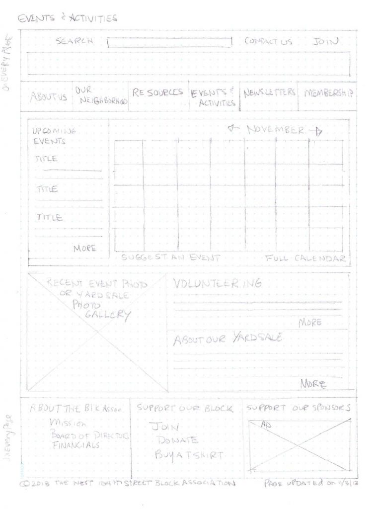
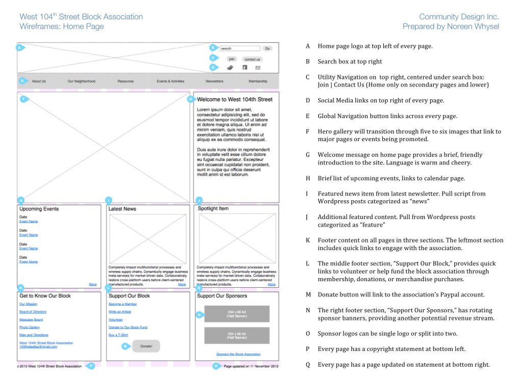
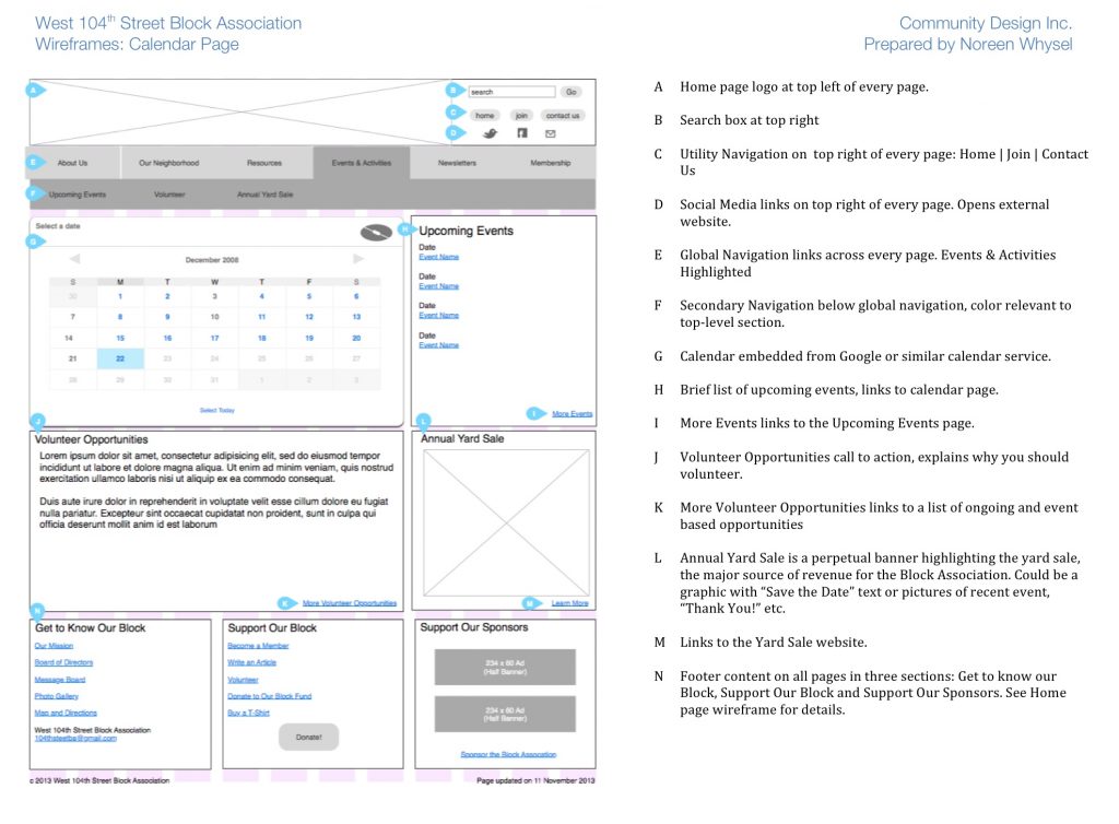
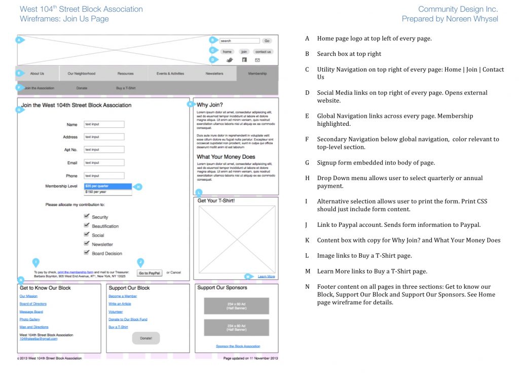